
The temperatures are falling, and the leaves are turning in the northern hemisphere. After a long hot summer, it’s finally autumn! Here are three tips to help make fall colors pop as you happily grab your camera and head out to enjoy the weather. These tips will work if you are shooting with your DSLR, mirrorless camera or even your iPhone. No need for processing. You can shoot JPGs. Ready?
Tip #1: Shoot early or late in the day to make fall colors pop.
The first thing to remember is that fall colors are warm colors. To make them pop, it helps to emphasize that warmth. When you shoot photos in the middle of the day, they naturally become cooler due to the strength of the sun. So, if you want to naturally show the warmth of fall colors, shoot them closer to the golden hour.
The story of the photo
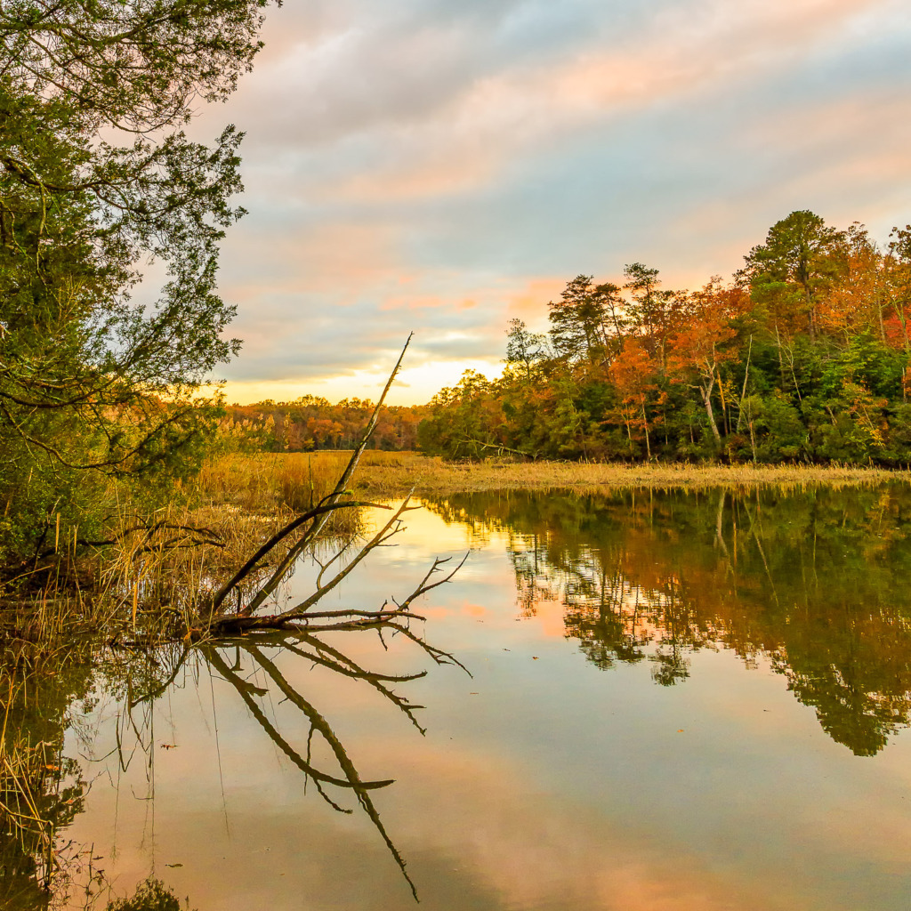
Here’s the story behind the photo of Halfway Creek. I had planned to take it for weeks. All I needed was an interesting sky full of warm colors, a high tide, and low light to make the fall colors of the leaves pop. The creek, which is tidal and flows into the James River, was about a three-minute drive and 15-minute walk from our house, down an old, deserted road. One afternoon, I glanced out of a western-facing window of our house and saw this colorful sky starting to develop. I grabbed my camera and told my husband where I was going in case I wasn’t back in an hour.
After parking my car near a path into the woods, I quickly walked to the old road and started toward the creek. I was surrounded by tall old trees and could just see the color of the sky developing above them.
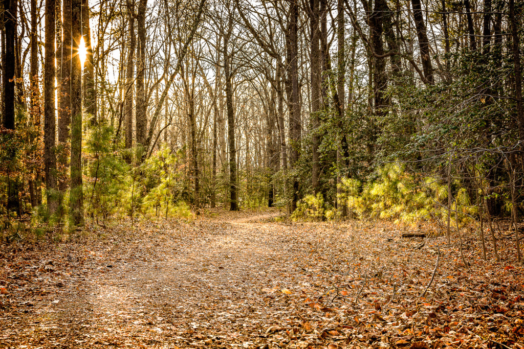
Here’s a winter photo of the road. It’s called Carters Grove Country Road and hasn’t been open to cars in years. At one time, it was a direct carriage route to Williamsburg from Carters Grove Plantation. Now, it runs through county land and is open to walkers and bicyclists.
When I arrived at the wooden bridge across the creek, and started to set up my camera, the light was fading fast. I had just enough time to fire off a few shots before it was dark.
Reality sets in
Then, of course, reality set in. I was deep in the woods with a tiny flashlight and my iPhone. (There was no cell phone coverage along the creek, by the way.) That’s the part of the planning I hadn’t gotten right! 🤣 Suddenly, there was a loud crashing sound in front of me. I peered through the fading light to see a large 8-point buck moving in the shallow waters of the creek, very close to me. Sadly, it was too dark to get a photo of him. I did try!
It was definitely time to go home. With thoughts of all the animals that were around me in the woods, I carefully made my way up the hill toward my car, using my iPhone flashlight for light. When I got home, I’d been gone an hour. My husband asked me where I’d been. I reminded him that I’d told him I was going to the creek on Country Road. Oh, he said. He hadn’t heard me. It’s one of those moments when you are really glad you didn’t get attacked in the woods!
Tips #2: Contrast will help make your fall colors pop.
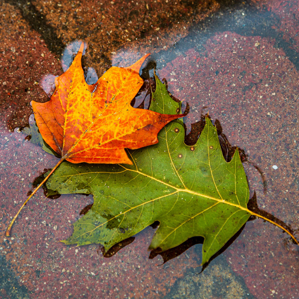
I found this red-orange leaf on the ground during a photo walk in Colonial Williamsburg. Picking it up, I started looking for places to include it in a photo. That’s sort of a bonus tip, by the way. Bringing props along on a photo walk can add a fun challenge to the day.
When I saw the blue-green leaf lying in a puddle, I knew I had found a perfect contrast to make the red-orange leaf stand out. If I had just laid the red-orange leaf on the pavement, it would have blended in. But because red and green are opposites on the color wheel, I knew the red-orange leaf would pop.
Do you see how the red-orange leaf accentuates the yellow veins of the green leaf? Who knew that leaf veins could create leading lines? (Another bonus tip, by the way!)
Take a look at a color wheel to make your fall colors pop.
The colors of autumn are red, yellow, and orange. If you look at a color wheel, their opposites are green, blue and violet. So, when you are trying to make your fall colors pop, these are the color combinations to look for.
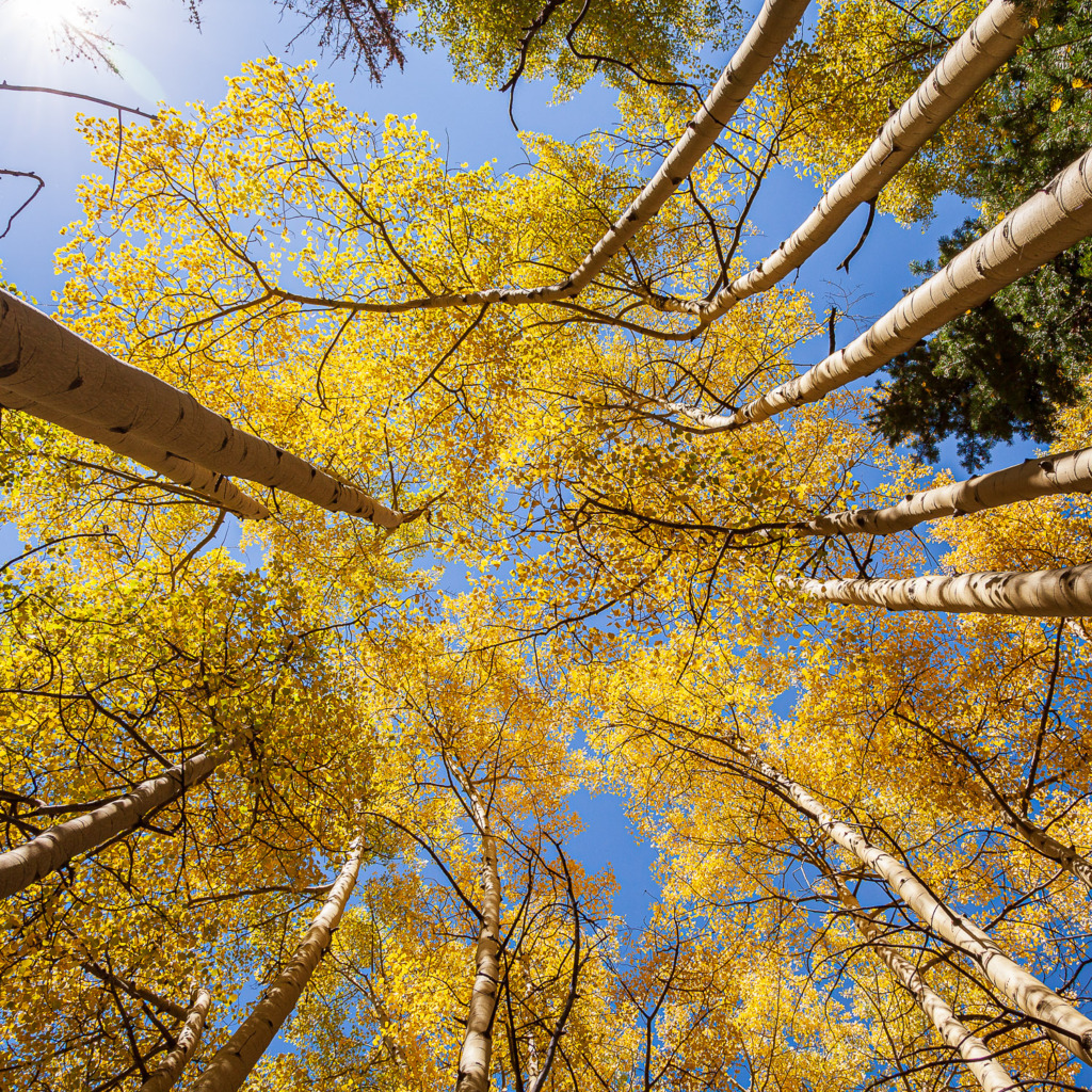
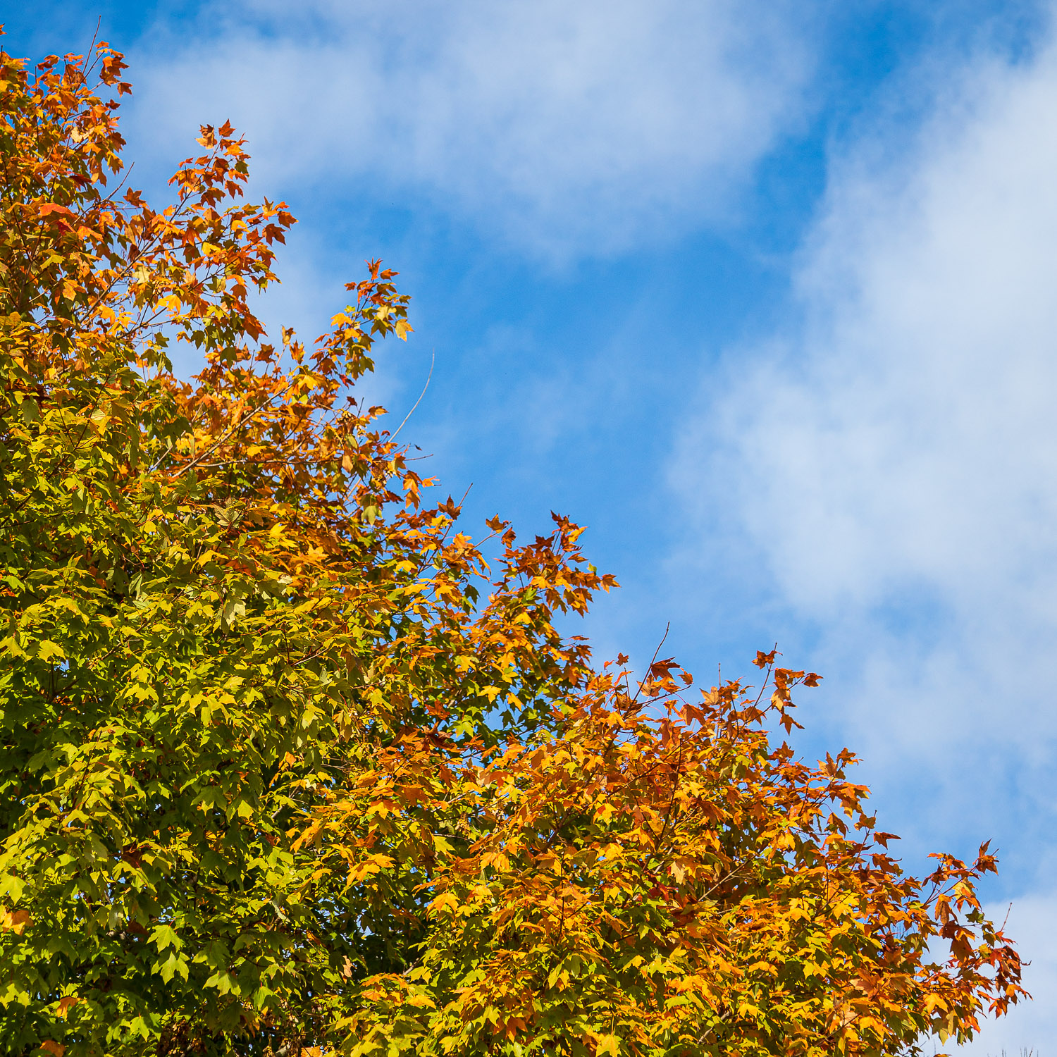
I shot this photo of aspen trees in the fall with the blue sky as a background. If it had been overcast that day, with a white sky, the photo wouldn’t have worked. Did you notice the sun flare in the upper left corner? Can you see how much less the golden leaves pop in that corner compared to the ones in the center of the photo? The gold of the center leaves is much richer.
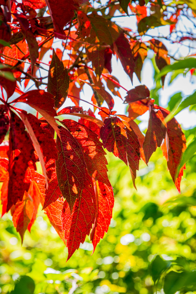
Here’s one more example of the power of contrast. Can you see the difference between how the fall colors pop at the bottom of the photo versus the top? At the top, with a white sky in the background, the red leaves seem flat and dull. At the bottom, the red leaves pop off the bright green background.
Tip #3: Know your camera to make fall colors pop.
Since this post is about getting the photo right in camera, it really helps to know whether your camera tends to shoot warm or cool photos. I’ve always been a Canon shooter and I like warm colors, so I never paid attention to this. Then, I started traveling with other photographers and realized that camera brands and models tend to record color temperature a little differently.
Slide back and forth to see the difference a slight change in white balance can make. If you slide all the way to the left, the photo has a warm color balance. It’s the color balance that my Canon 5D Mark IV chose while it was set to Auto White Balance.
If you slide all the way to the right, you’ll see the colors cool slightly. You may notice it more in the blue in the sky and the green in the leaves.
Now here’s a tip I learned from my friends who shoot Nikons. Change your camera’s White Balance setting to Cloudy or Shady to shoot warmer photos. I’ll include a link to an article about this from Nikon below.
As for my Canon, I learned that Canons tend to shoot warmer photos as you could see in the photo above.
Finally, why not try out different color balances as you shoot a scene to see what you like?
Ready for more?
I wrote a blog post about fall colors last year. It has even more details in it and also gives some post-processing ideas. You can read it here.
And here’s another post I’ve written about shooting fall colors: https://www.carolinemaryan.com/shooting-fall-colors/
Here’s a link to the article about white balance and Nikon cameras.
What can you do if colors don’t change where you live? (We used to live in Jakarta, Indonesia. We had two seasons: rainy and dry. So I understand. 😉) You can buy colorful fall vegetables or flowers. Even silk flowers will do when you want to capture fall colors!
What’s your favorite thing to shoot photos of in the fall? Where do you get the best shots? Share in the comments to help your fellow photographers out with inspiration!
You might also like


Leave a reply